How to Build a Login Screen in SwiftUI

A SwiftUI login screen is a small UI with high product risk. It needs to look clean, handle keyboard and accessibility states, and connect to authentication without storing sensitive data in the view layer.
Quick Answer
A SwiftUI login screen should do more than look good. It needs clear focus behavior, secure password entry, disabled submit states, validation messages, loading feedback, error recovery, forgot-password routing, accessibility labels, and a safe handoff to the authentication layer.
Use SecureField for passwords, avoid storing raw passwords locally, and keep tokens in secure storage managed by your auth provider or keychain layer. The login view should collect input and render state; business rules belong in a ViewModel or auth service.
For production-ready Swift foundations, compare iOS App Templates. If your authentication flow includes custom roles, enterprise SSO, payments, or compliance requirements, use custom app development so the UX and backend security model are designed together.
Login Screen Checklist
- Email, password, loading, disabled, and error states.
- Forgot password and sign-up routing.
- Keyboard-safe layout on small screens.
- Accessibility labels and Dynamic Type support.
- Secure storage for tokens, never raw passwords.
- Analytics events that do not log credentials.
The rest of this tutorial builds the login UI step by step. Keep the screen code simple, then connect it to an auth service or ViewModel so validation, loading, and token handling stay out of the view body.
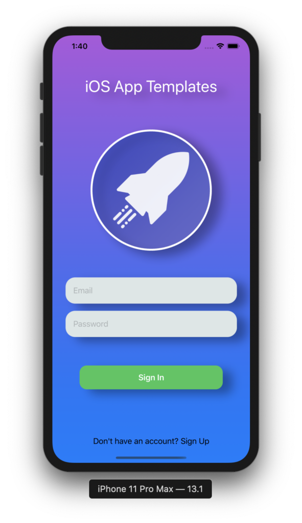
Let's look at the structure and turn it into a maintainable SwiftUI login screen.
1. Build the Skeleton
Add this block of code inside body property. Also, declare two properties as follows:
// MARK: - Propertiers
@State private var email = ""
@State private var password = ""

// MARK: - View
var body: some View {
  VStack() {
    Text("iOS App Template")
    Image("iosapptemplate")
    TextField("Email", text: self.$email)
    TextField("Password", text: self.$password)
    Button("Sign In") {}
  }
}
The above code is so easy to understand that a person who has never been exposed to SwiftUI (not even to iOS programming) can have a rough idea of what our app is doing. We declare the components that we want and trust SwiftUI that it will help with rendering the UI part.
Believe it or not, we are halfway there already. The next part is just reorganizing the structure and re-styling the components to create an eye-catching screen.
2. Reorganize the structure and style our components
a. Textfields
Change two textfields as follows
VStack {
  TextField("Email", text: self.$email)
  SecureField("Password", text: self.$password)
}
We should put the text fields on the same stack for easy control. Normally, in screens during the Authentication stage (such as Login, SignUp), text fields often have the same frames or constraints, for a great UI & UX. Let’s give a try.
VStack(alignment: .leading, spacing: 15) {

  TextField("Email", text: self.$email)
    .padding()
    .background(themeTextField)
    .cornerRadius(20.0)

  SecureField("Password", text: self.$password)
    .padding()
    .background(themeTextField)
    .cornerRadius(20.0)
}.padding([.leading, .trailing], 27.5)
As you can see, the parts like padding or spacing of these text fields are the same. Instead of having to configure each one, we put all the text fields into VStack and just do it on this component itself.
b. Texts and Images
Basically, this section does not have too many details to talk about. If you look at their definitions, you can see the APIs that you need. Also, right-click on the Previews section will also update our code directly. Now let’s try some text and image modifiers.
Text("iOS App Template")
  .font(.largeTitle).foregroundColor(Color.white)
  .padding([.top, .bottom], 40)

Image("iosapptemplate")
  .resizable()
  .frame(width: 250, height: 250)
  .clipShape(Circle())
  .overlay(Circle().stroke(Color.white, lineWidth: 4))
  .shadow(radius: 10)
  .padding(.bottom, 50)
c. Buttons
In the first piece of code, you might have noticed one of the Button declarations. Very easy to understand, right? We usually divide a Button into two parts, part one being its action. And part two is where we will layout all of it.
Button(action: {}) {
  Text("Sign In")
    .font(.headline)
    .foregroundColor(.white)
    .padding()
    .frame(width: 300, height: 50)
    .background(Color.green)
    .cornerRadius(15.0)
}
d. Color Gradient
By now basically everything is done, the next step is to “color” them. In this section, we will also show you how to use gradient colors. Add the following code in the closing curly bracket of the biggest VStack to the following code.
.background(
  LinearGradient(gradient: Gradient(colors: [.purple, .blue]), startPoint: .top, endPoint: .bottom)
    .edgesIgnoringSafeArea(.all))
We used the Gradient object with purple and blue to blend and the gradient color to be blended from top to bottom. Gradient(colors: [.purple, .blue]), startPoint: .top, endPoint: .bottom).
Everything is fine now except for one thing. Our VStack doesn’t fill up the entire screen. Here is the tip. Add Spacer() inside the VStack, it will make the VStack fill the height of the screen.
We can make it more eye-catching with a shadow for each component. Now, let’s build and run the app to enjoy the fruits of our labor.
3. Where to go from here?
You now you know how to build a complex UI containing TextFields, Texts, Images, and Buttons, but there’s plenty more you can do, including authenticating emails or passwords, show an alert to tell users if they logged in successfully or failed.
I hope you learned something new in this tutorial. Since a lot of stuff about SwiftUI is coming, make sure you do not miss any updates in this series. If you have any concerns or questions, feel free leave a comment below! And don’t forget to give us 1 star on Github. Thanks so much.