React Native Charts: Libraries, Patterns, and Performance
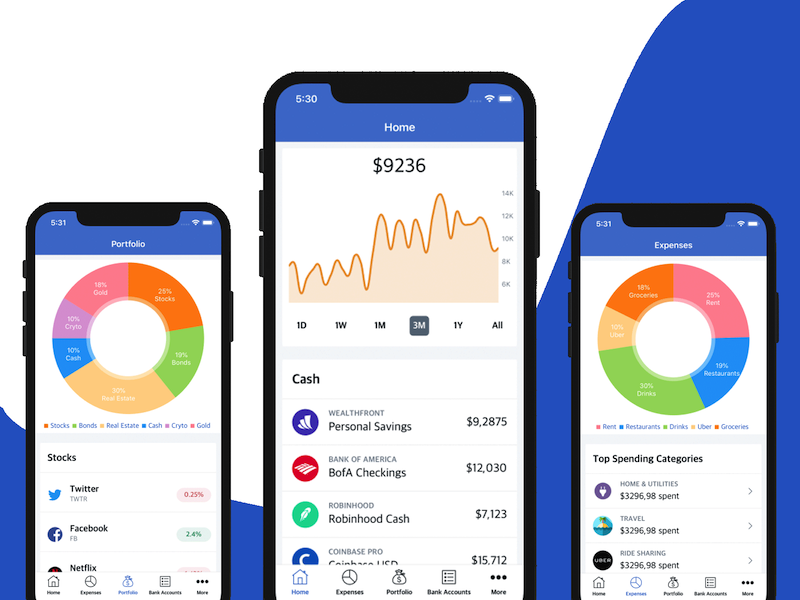
Charts can make a mobile app easier to understand when the data is trustworthy and the interaction is fast. Business dashboards, finance apps, analytics products, ecommerce admin screens, health apps, and fitness apps all benefit from charts when the visualization answers a clear question. The examples below are a starting point; production apps should choose chart libraries based on data volume, gestures, accessibility, and device performance.
Quick Answer
React Native charts should be chosen by data volume, interaction needs, and rendering constraints. Small dashboards can use SVG-based libraries. Large analytics screens need server-side aggregation, downsampling, pagination, memoized datasets, accessible labels, and release-device performance checks.
Many chart libraries depend on react-native-svg, so verify SVG compatibility before adopting a chart package. If the chart drives business decisions, make the data pipeline trustworthy before adding visual complexity.
Chart Checklist
- Precompute aggregation before rendering.
- Keep datasets small and memoized.
- Add loading, empty, error, and no-permission states.
- Provide accessible labels or a data table alternative.
- Test low-end Android devices and release builds.
Installing React Native Charts Kit
In the first step of adding charts into a mobile app, we need to install the react-native-chart-kit npm package into our existing React Native project. You can do so by using NPM or yarn.
//Using NPM:
npm install react-native-chart-kit

//Using yarn:
yarn add react-native-chart-kit
Importing Charts components into React Native
In order to have all the Charts APIs available in React Native, we need to import the package that we’ve just integrated in the project. You can do so by using the following piece of code:
import {
  LineChart,
  BarChart,
  PieChart,
  ProgressChart,
  ContributionGraph,
  StackedBarChart,
} from "react-native-chart-kit";
That’s it. Now you get access to various chart types, which are accessible from your JavaScript code.
Creating a Line Chart in React Native
After the importing of our charts plugin successfully, we are going to create a line chart in React Native. As we have already imported all the chart components in the previous step, we just need to supply the data to the built-in line chart component as follows:
const line = {
  labels: ["January", "February", "March", "April", "May", "June"],
  datasets: [
    {
      data: [20, 45, 28, 80, 99, 43],
      strokeWidth: 2, // optional
    },
  ],
};
The code above represents the dataset for our line chart component, that will be displayed in a line chart view, in our project. As you can notice, for the scope of this tutorial, we are using hardcoded static data. In most projects, this data will be previously fetched from a server or local database. But for learning purposes, we should be good with mock data for now. Now that we have the data we want to show to your users, we are going to use the LineChart component imported from our React Native Charts plugin. The code snippet to implement the line chart with our chart dataset and other properties is given below. You can customize the properties such as height, width, axis-labels, chart configs, etc to your liking. Check out the documentation to learn more about all the customizations you can do to a line chart.
<View>
  <Text>Bezier Line Chart</Text>
  <LineChart
    data={linedata}
    width={Dimensions.get("window").width} // from react-native
    height={220}
    yAxisLabel={"$"}
    chartConfig={{
      backgroundColor: "#e26a00",
      backgroundGradientFrom: "#fb8c00",
      backgroundGradientTo: "#ffa726",
      decimalPlaces: 2, // optional, defaults to 2dp
      color: (opacity = 1) => `rgba(255, 255, 255, ${opacity})`,
      style: {
        borderRadius: 16,
      },
    }}
    bezier
    style={{
      marginVertical: 8,
      borderRadius: 16,
    }}
  />
</View>
Run your projects and open the screen containing the newly added line chart. As a result, you will get the line chart shown in the following screenshot:
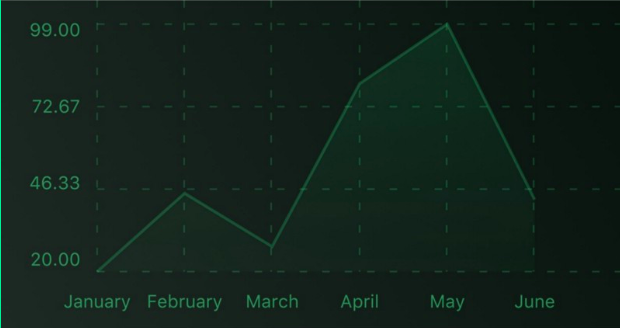
Line charts can be used for displaying various metrics and their evolution over time. A few examples of line charts used across the mobile app industry: cashflow statistics, currency rates over time, Bitcoin price, stock prices, calorie burn statistics, BMI progress, revenue, sales, margins, etc.
Making a Bar Chart in React Native
As you’ve probably anticipated already, we are going to use a BarChart component that we import from the react-native-chart-kit plugin. The chart dataset we are going to supply to the BarChart component is exactly the same as that of the line chart represented by the barData object here. Notice how the bar chart displays the data in comparison to the line chart. The React Native code snippet for the chart dataset is provided below:
const barData = {
  labels: ["January", "February", "March", "April", "May", "June"],
  datasets: [
    {
      data: [20, 45, 28, 80, 99, 43],
    },
  ],
};
The code snippet to implement the bar chart using our chart dataset and other UI tweaks is given below. You can customize the properties such as height, width, axis-labels, chart configs, etc to your liking. Here’s the code example:
<BarChart
  // style={graphStyle}
  data={barData}
  width={screenWidth}
  height={220}
  yAxisLabel={"$"}
  chartConfig={chartConfig}
/>
Pretty straightforward, right? As a result, you will get the following bar chart:
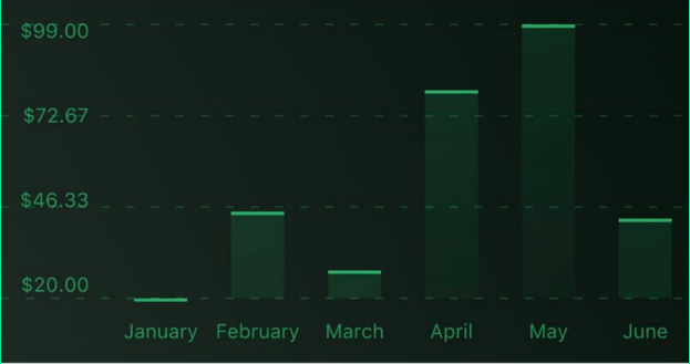
You can use bar charts to visualize and compare data that are grouped in different categories or over longer time windows (such as months, years). This includes examples such as budget spending categories, revenue per country, sales per month, profit per year, etc.
Creating Pie Charts in React Native
Similarly, we are going to use a PieChart component that is included in the react-native-chart-kit plugin. We are going to build a hardcoded pieData, which is the pie chart dataset that will be shown in the visual graph The advantage of using pie chart in React native is that you can display statistics of multiple dimensions of data which is not possible in a line or bar chart. Here’s the code snippet for the pie chart dataset:
const pieData = [
  {
    name: "Seoul",
    population: 21500000,
    color: "rgba(131, 167, 234, 1)",
    legendFontColor: "#7F7F7F",
    legendFontSize: 15,
  },
  {
    name: "Toronto",
    population: 2800000,
    color: "#F00",
    legendFontColor: "#7F7F7F",
    legendFontSize: 15,
  },
  {
    name: "Beijing",
    population: 527612,
    color: "red",
    legendFontColor: "#7F7F7F",
    legendFontSize: 15,
  },
  {
    name: "New York",
    population: 8538000,
    color: "#ffffff",
    legendFontColor: "#7F7F7F",
    legendFontSize: 15,
  },
  {
    name: "Moscow",
    population: 11920000,
    color: "rgb(0, 0, 255)",
    legendFontColor: "#7F7F7F",
    legendFontSize: 15,
  },
];
The source code implementing the pie chart backed by our pieData dataset is illustrated below. You can customize styling properties such as height, width, axis-labels, chart configs, etc. Here’s the React Native code:
<PieChart
  data={pieData}
  width={screenWidth}
  height={220}
  chartConfig={chartConfig}
  accessor="population"
  backgroundColor="transparent"
  paddingLeft="15"
  absolute
/>
As a result, you will get the pie chart with index labels represented by the following screenshot:
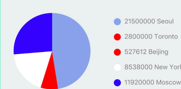
You can use Pie Charts in your React Native app to display categorized data and compare category volumes between each other. For example, an investment app might use a pie chart to show the portfolio diversification or the money spending categories. An analytics app might display the traffic volume per acquisition channel (SEO, Ads, Direct, E-mail, etc) in a pie chart. You get the idea.
Bottom Line
Adding React Native Charts into a mobile app is pretty straightforward if you leverage the open source react-native-chart-kit. Given they don’t require a lot of development effort, it’s usually a great idea to delight your app users with beautiful rich graphs. Charts significantly boost the user experience and will make your app stand out from the crowd. We highly recommend you to play around with everything the react-native-chart-kit library has to offer. Try to build beautiful experiences, with matching colors and don’t forget that amazing your users is the top priority of any React Native developer. We can’t wait to see everything you’re going to build with this tutorial. Please help us spread the word by sharing our article so that other people can learn how to build charts in their React Native apps. Happy Coding!
Next Steps
Now that you have learned about resources to learn React Native development, here are some other topics you can look into
-
Firebase — Push notifications | Firebase storage
-
How To in React Native — WebView | Gradient| Camera| Adding GIF| Google Maps | Redux | Debugging | Hooks| Dark mode | Deep-link | GraphQL | AsyncStorage | Offline |Chart | Walkthrough | Geolocation | Tinder swipe | App icon | REST API
-
Authentication — Google Login| Facebook login | Phone Auth |
-
Best Resource – App idea | Podcast | Newsletter| App template
If you need a base to start your next React Native app, you can make your next awesome app using manyReact Native template.